The right color palette transforms a house into a home—literally overnight. In 2026, luxury villa design is moving toward warm neutrals layered with strategic accent colors, creating spaces that feel both sophisticated and genuinely livable. Whether you’re furnishing a Mediterranean coastal retreat or a contemporary urban penthouse, your color choices will determine whether visitors feel impressed or at home.
Key insight for busy homeowners and designers: This year’s best palettes balance timeless elegance with practical livability. Skip the trendy all-white aesthetic—2026 is about warmth, depth, and personal expression.
What’s Driving 2026 Color Trends in Luxury Interiors
The Shift Away from Minimalist Monotony
The all-white minimalist movement dominated interior design for nearly a decade. While undeniably elegant in photos, white-dominated spaces often feel cold, clinical, and impractical for families. In 2026, we’re seeing a decisive shift toward warmth, texture, and lived-in sophistication.
Luxury homeowners increasingly seek interiors that:
- Feel collected rather than decorated
- Show personality without sacrificing elegance
- Age gracefully rather than looking dated within years
Influences Shaping This Year’s Palette
Three major influences are driving 2026’s villa color trends:
- Biophilic design – Connecting interiors with nature through earthy greens, warm browns, and natural stone tones
- Global travel recovery – As international travel resumes, influences from Mediterranean, Japanese, and Scandinavian design are blending in fresh ways
- Wellness prioritization – Colors that support mental health and reduce stress are increasingly valued
The Foundation: Understanding Undertones
Before selecting specific colors, understanding undertones is crucial. Every color exists on a spectrum with warm (yellow, orange, red) or cool (blue, green, purple) undertones. Mixing warm and cool undertones creates visual discord—a room that feels “off” without obvious explanation.
Universal Undertone Rules
表格
| Tone Type | Undertone | Best Paired With | Avoid |
|---|---|---|---|
| Warm | Yellow, peach, terracotta | Other warm tones, cream, gold | Cool grays, silvers |
| Cool | Blue, gray, green | Other cool tones, navy, chrome | Warm beiges, oranges |
| Neutral | Gray-beige | Both warm and cool | Strong primaries |
Pro tip: Test colors by viewing them next to a white poster board. White reveals true undertones without interference.
2026’s Top 5 Villa Color Palettes
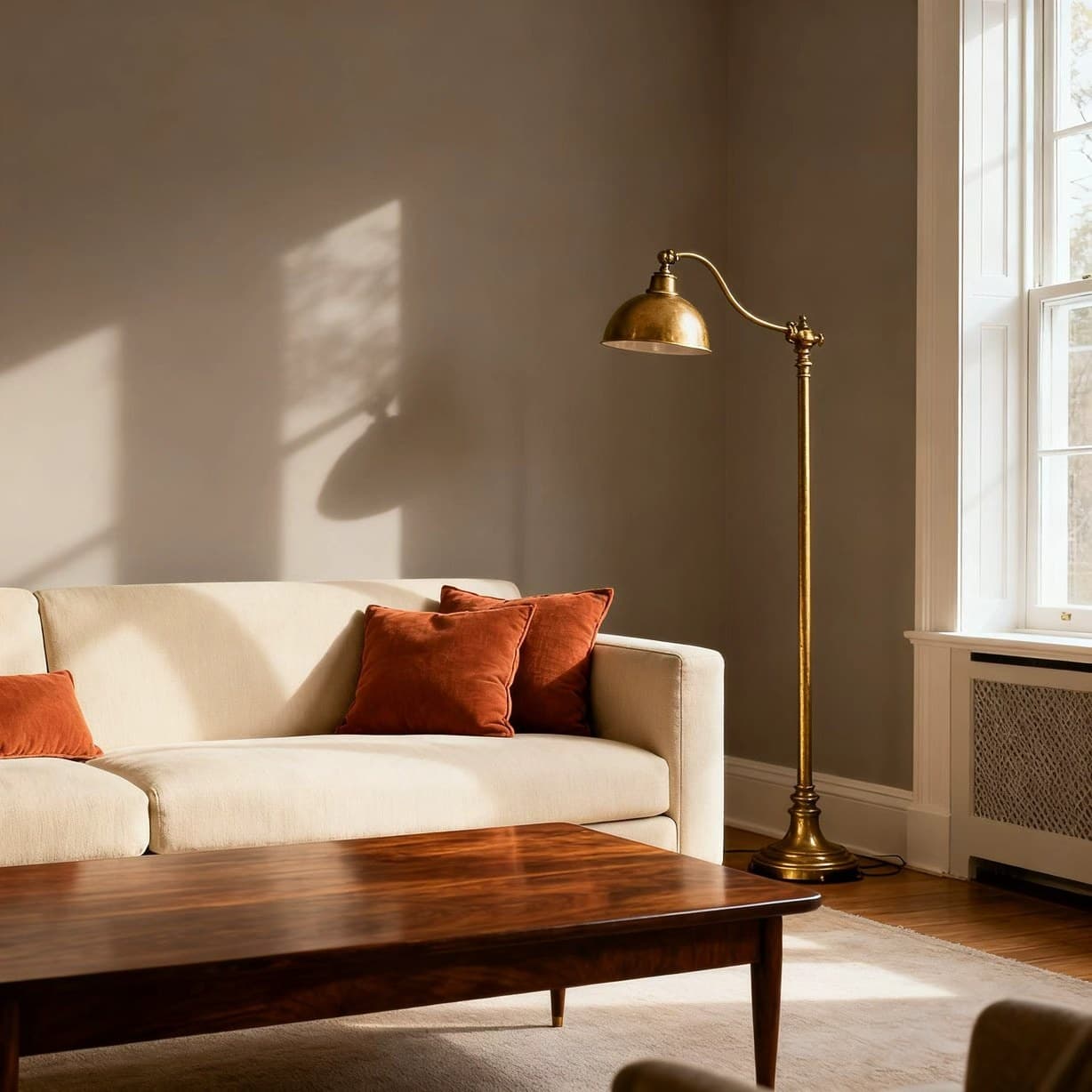
Palette 1: Warm Neutrals with Terracotta Accents
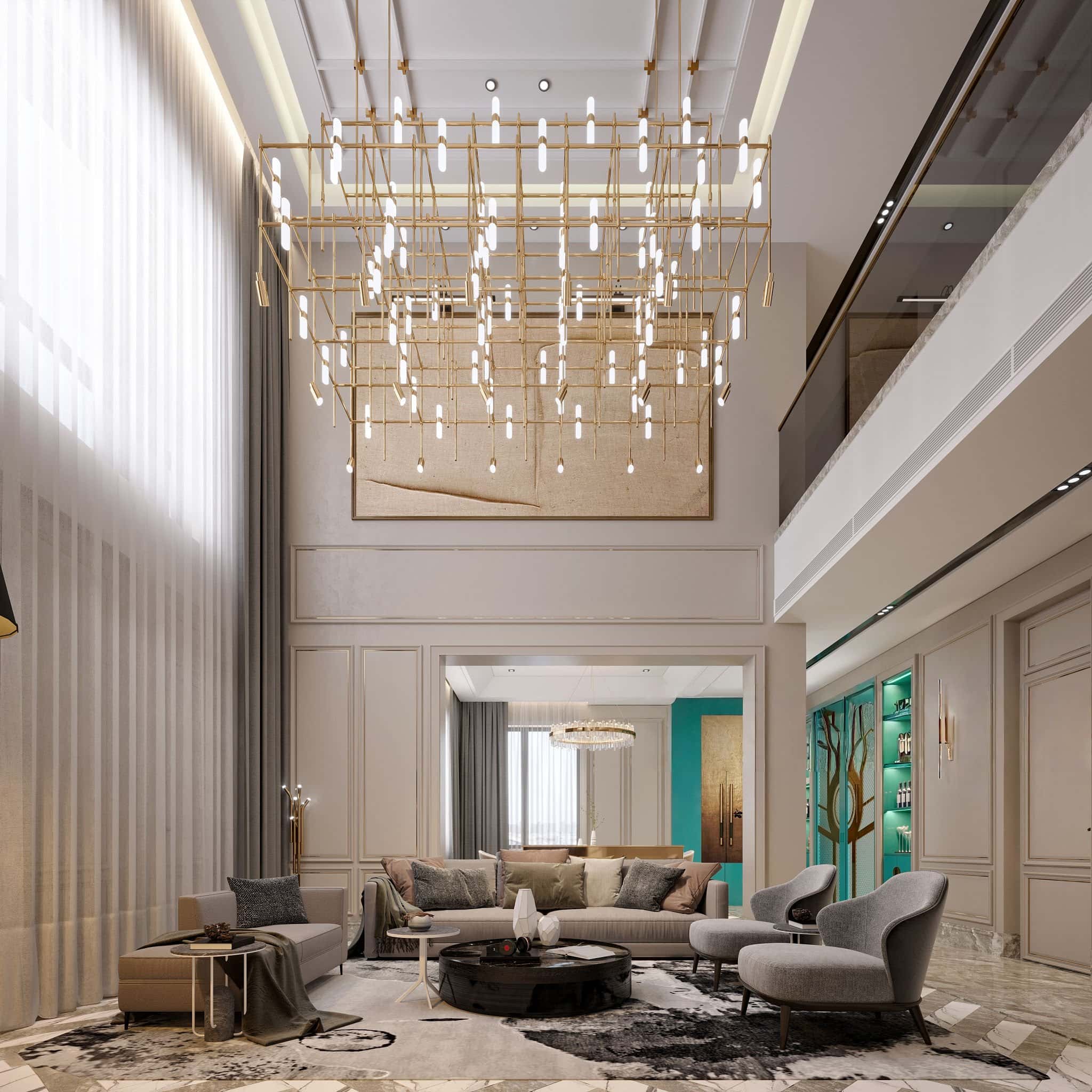
This palette embraces the timeless appeal of neutrals while adding earthy warmth through terracotta and rust accents. Perfect for living rooms, dining areas, and entryways where first impressions matter.
表格
| Element | Color Name | Hex Range | Application |
|---|---|---|---|
| Primary | Warm Greige | #C9C0B8 | Walls, large surfaces |
| Secondary | Soft Cream | #F5F0E8 | Ceilings, trim |
| Accent | Terracotta | #C2715B | Throw pillows, artwork |
| Anchor | Deep Walnut | #5C4033 | Furniture, built-ins |
| Highlight | Antique Gold | #C9A962 | Lighting, hardware |
Why it works: Warm neutrals create an inviting foundation that photographs beautifully and feels luxurious in person. Terracotta adds just enough color to prevent monotony without overwhelming.
Best for: Living rooms, great rooms, dining spaces, Mediterranean or Southwest-inspired villas
Palette 2: Sage Green & Natural Linen
Nature-inspired and endlessly sophisticated, this palette brings the tranquility of outdoor spaces inside. Sage green works particularly well in kitchens, bathrooms, and bedrooms—spaces where calm is paramount.
表格
| Element | Color Name | Hex Range | Application |
|---|---|---|---|
| Primary | Sage Green | #9CAF88 | Walls, upper cabinets |
| Secondary | Natural Linen | #E8E0D5 | Upholstery, drapes |
| Accent | Dusty Blue | #8FAABC | Throw items, art |
| Anchor | Warm White | #F8F6F0 | Ceilings, trim |
| Texture | Light Oak | #D4C4A8 | Flooring, furniture |
Why it works: Green tones have proven psychological benefits—reduced anxiety, improved mood, enhanced creativity. Combined with natural textures, this palette creates spaces that genuinely refresh.
Best for: Kitchens, bathrooms, bedrooms, home offices, wellness spaces
Palette 3: Coastal Blues with Warm Wood
Inspired by contemporary coastal design, this palette balances cool blues with warm wood tones, creating spaces that feel both refreshing and grounded. The key is warmth—avoiding the cold, beach-house stereotype of pure white and navy.
表格
| Element | Color Name | Hex Range | Application |
|---|---|---|---|
| Primary | Soft Ocean Blue | #A8C5D9 | Walls, accent walls |
| Secondary | Warm Sand | #D9C5A8 | Flooring, furniture |
| Accent | Deep Navy | #2C3E50 | Pillows, artwork frames |
| Anchor | Weathered Teak | #8B7355 | Built-ins, woodwork |
| Highlight | Brass | #C9A962 | Fixtures, hardware |
Why it works: Blues promote calm and focus, while warm wood prevents the palette from feeling sterile. This combination works year-round—bright and airy in summer, cozy and grounded in winter.
Best for: Bedrooms, living rooms, home offices, waterfront properties
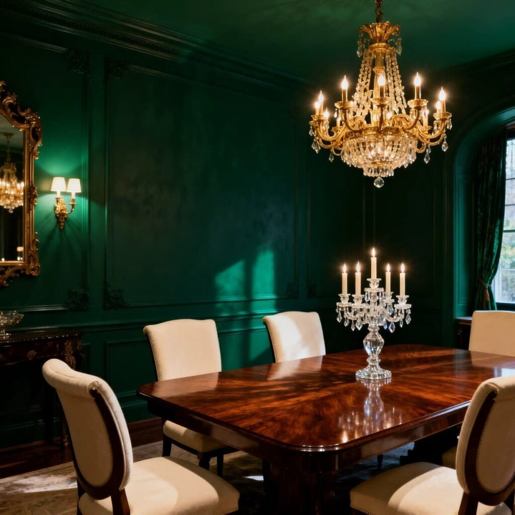
Palette 4: Dramatic Jewel Tones
For those seeking boldness, jewel tones offer a striking alternative to conventional neutrals. Deep emerald, sapphire, and amethyst create dramatic backdrops for metallic accents and white marble.
表格
| Element | Color Name | Hex Range | Application |
|---|---|---|---|
| Primary | Deep Emerald | #2D5A4A | Walls, built-in cabinets |
| Secondary | Cream | #F5F0E6 | Upholstery, rugs |
| Accent | Antique Gold | #C9A962 | Lighting, trim |
| Anchor | Rich Mahogany | #4A2C2A | Furniture |
| Highlight | Crystal | #FFFFFF | Marble, glass elements |
Why it works: Jewel tones add instant luxury and drama without relying on expensive materials. A single accent wall in emerald transforms a room, while cream and gold provide balance.
Best for: Libraries, dining rooms, powder rooms, accent walls throughout
Palette 5: Scandinavian Light with Warm Accents
Blending Scandinavian simplicity with Mediterranean warmth, this palette emphasizes natural light while avoiding the coldness of pure white. Soft grays, warm woods, and tactile textures create spaces that feel both minimal and inviting.
表格
| Element | Color Name | Hex Range | Application |
|---|---|---|---|
| Primary | Soft Warm Gray | #D5D0C8 | Walls throughout |
| Secondary | Pure White | #FFFFFF | Ceilings, trim |
| Accent | Cognac Leather | #8B4513 | Furniture, accents |
| Anchor | Pale Oak | #D9C8A8 | Flooring, shelving |
| Texture | Natural Sheepskin | #F0EBE0 | Soft furnishings |
Why it works: This palette maximizes natural light while adding warmth through materials rather than color. It’s infinitely adaptable—add colorful art or textiles without clashing.
Best for: All rooms, especially smaller spaces, north-facing rooms, minimalist aesthetics
Room-by-Room Color Strategy
Living Room Palettes
The living room sets the tone for your entire home.
- Family-friendly living: Warm neutrals base (#C9C0B8) + Deep accent wall (#5C4033 walnut) + Cream upholstery + Brass accents
- Formal entertaining: Deep jewel tone on accent wall + Cream or soft gray throughout + Gold or brass metallics + Rich wood furniture
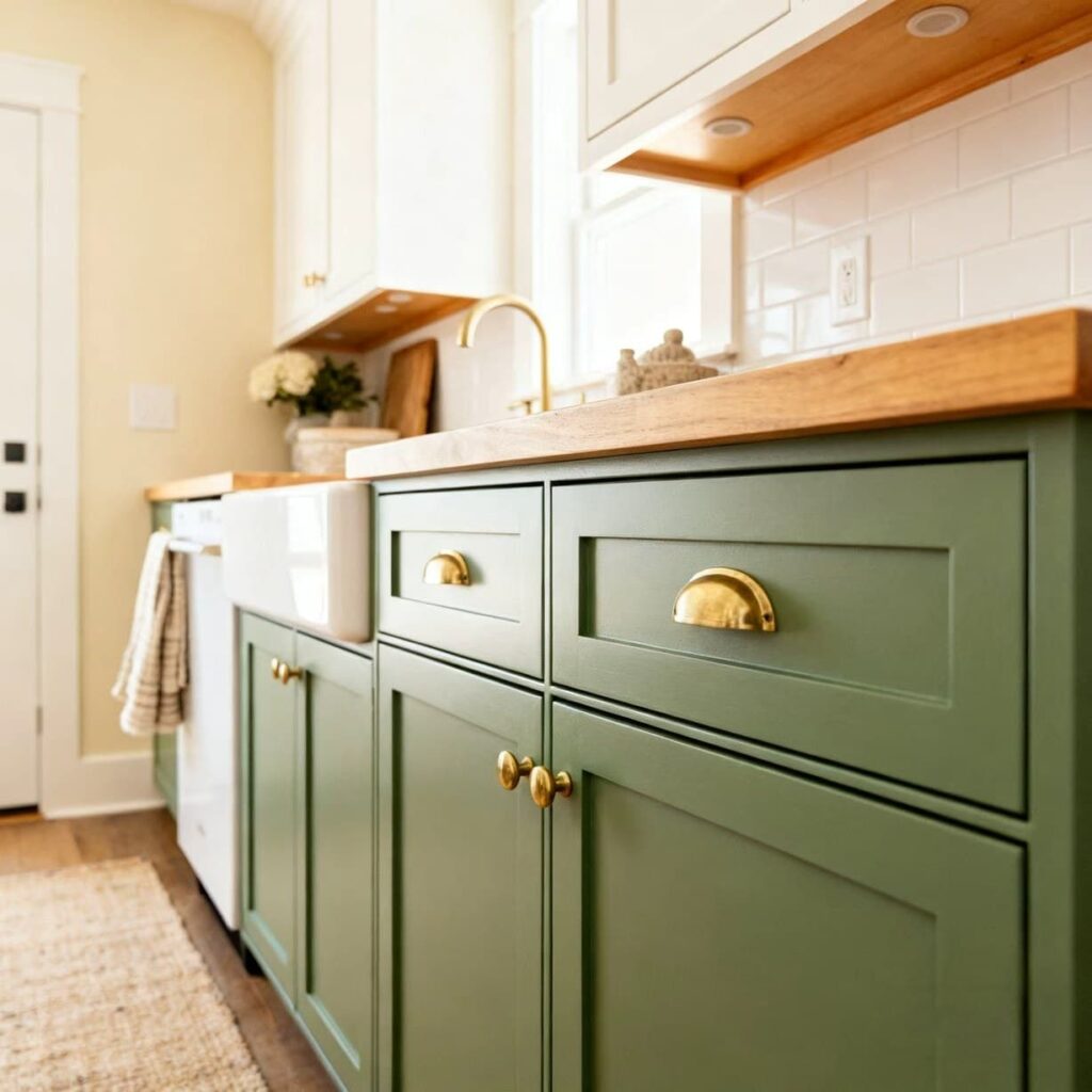
Kitchen Color Decisions
Kitchens demand practicality alongside beauty. Key considerations:
- Cabinet color affects perceived cleanliness – Dark cabinets show dust and fingerprints more than light ones
- Countertop coordination – Neutral palettes work with more countertop options
- Backsplash flexibility – Neutral walls allow bold backsplash choices
2026 kitchen palette recommendation:
- Lower cabinets: Deep navy or forest green
- Upper cabinets: Warm white or cream
- Walls: Soft greige
- Countertops: White marble or quartz
- Backsplash: Herringbone in complementary tone
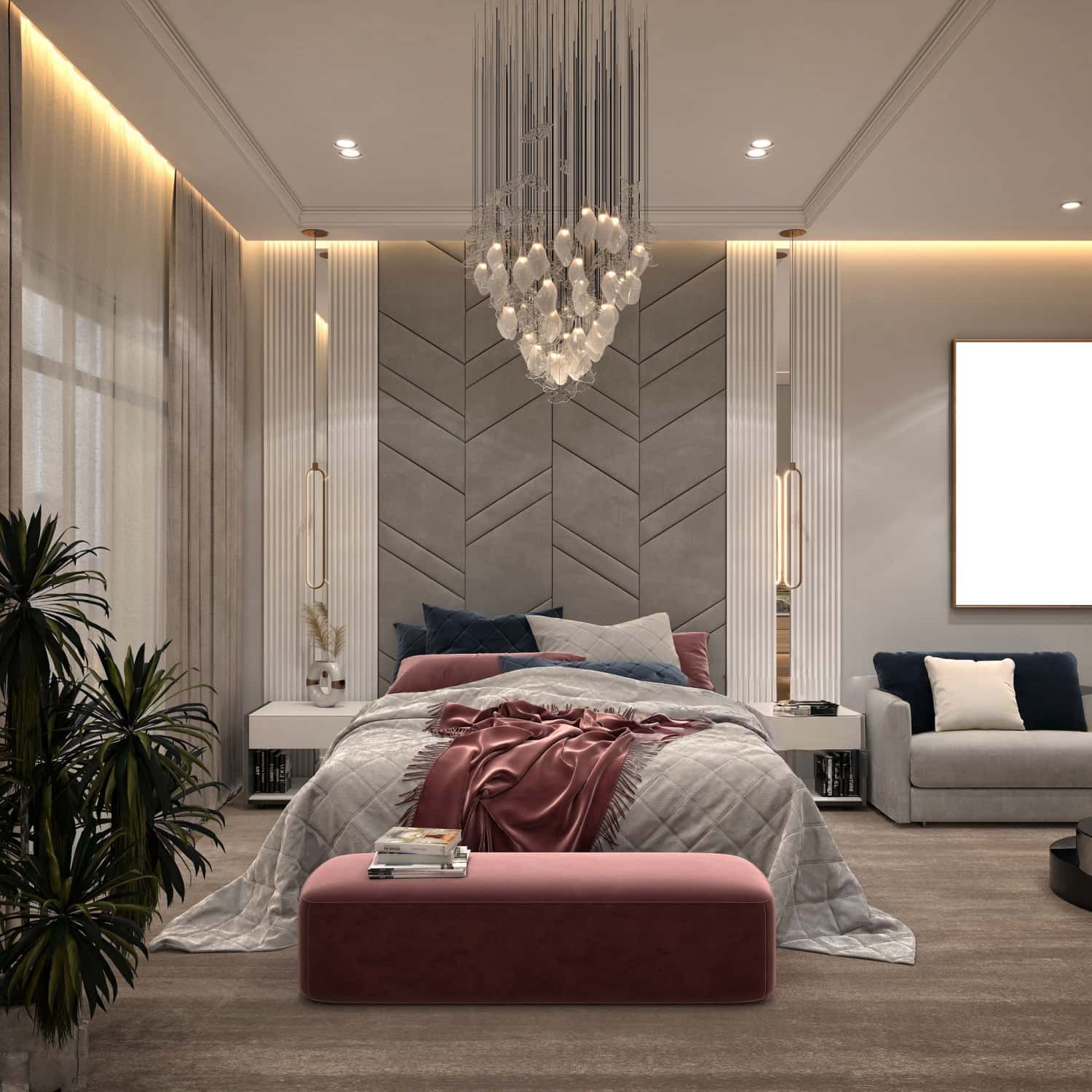
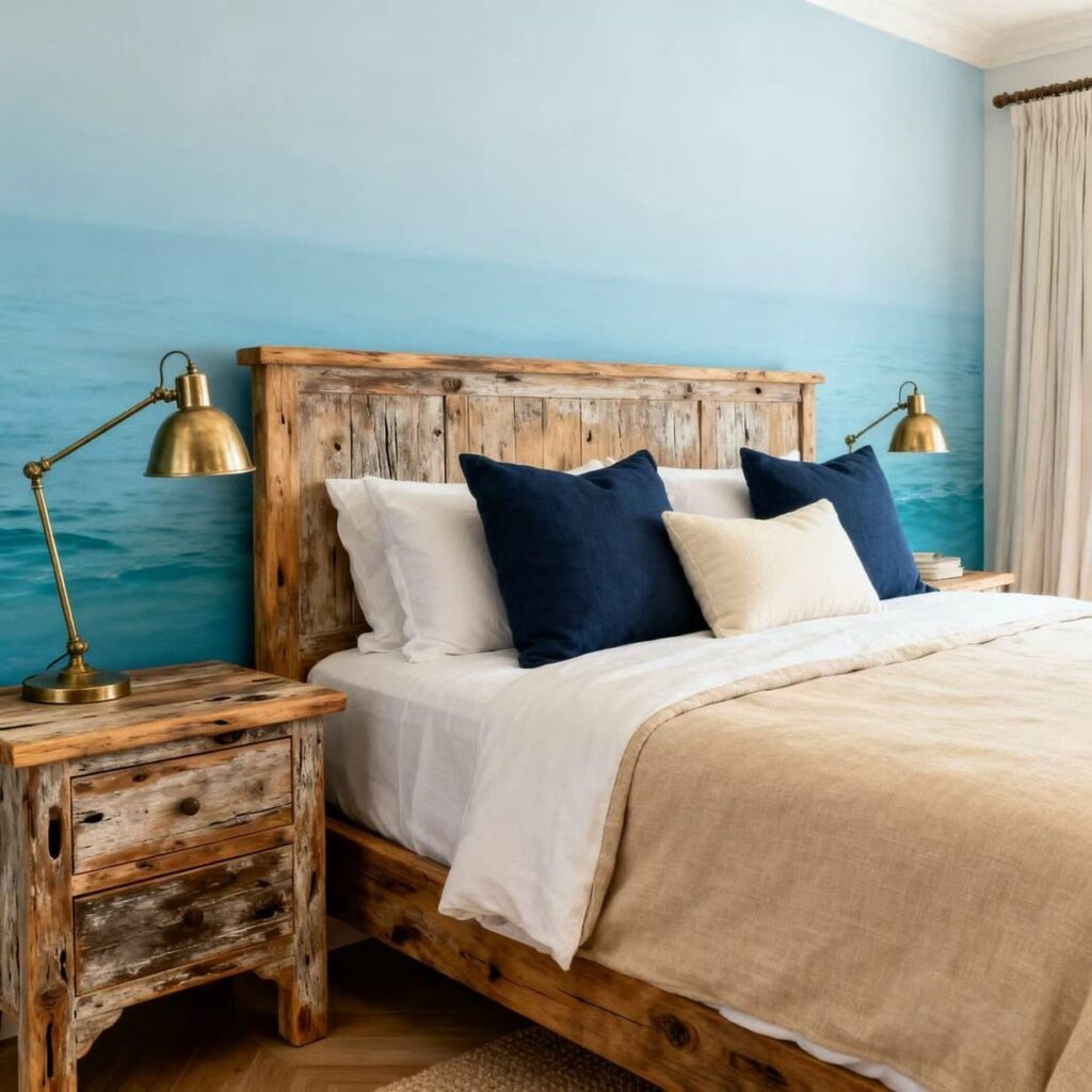
Bedroom Color Psychology
Bedrooms should promote rest and relaxation.
表格
| Color Family | Psychological Effect | Best For |
|---|---|---|
| Soft blues | Calming, sleep-promoting | Primary bedrooms |
| Sage greens | Restful, nature-connected | Guest rooms |
| Warm neutrals | Cozy, grounded | Master suites |
| Soft lavenders | Relaxing, romantic | Reading nooks |
| Earth tones | Secure, stable | All bedrooms |
Common Color Mistakes to Avoid
Mistake 1: Ignoring Lighting Conditions
The same color looks dramatically different in north/south natural light, incandescent/LED lighting.
Solution: Test colors in the actual room at different times of day before committing.
Mistake 2: Matching Everything Perfectly
Rooms with perfect matching feel sterile. Successful palettes need:
- Slight variations in tone
- Mix of textures
- Unexpected accent colors
- Personal touches
Mistake 3: Following Trends Too Faithfully
Trendy colors date quickly. Invest in:
- Quality neutrals for large surfaces
- Trendier colors in easily changed elements (pillows, art)
- Classic pieces that work with evolving palettes
Mistake 4: Neglecting Flow Between Rooms
Adjacent rooms should share a consistent color story or transition deliberately; avoid jarring contrast.
Implementing Your Color Palette: A Practical Checklist
Before painting or purchasing, verify each element:
- Undertones are consistent across all colors selected
- Palette has been tested in actual lighting conditions
- 60-30-10 rule is applied (60% dominant, 30% secondary, 10% accent)
- Adjacent room palettes are considered
- Furniture and fabric can work with the palette
- Personal style preferences are incorporated
- Practical maintenance considerations addressed
- Resale value implications considered
The Fenmi Casa Approach to Color
At Fenmi Casa, we understand that color selection is deeply personal yet technically demanding. Our design consultants work with clients to:
- Analyze existing elements – Architecture, flooring, fixed furniture that must be accommodated
- Understand lifestyle needs – Family size, entertaining frequency, maintenance preferences
- Develop cohesive palettes – Ensuring flow between rooms while maintaining distinct character
- Implement gradually – Allowing adjustments as the space comes together
We bring 30 years of furniture manufacturing expertise and European design sensibility to every project, helping clients avoid costly color mistakes while achieving spaces that truly reflect their vision.
Frequently Asked Questions
How do I choose the right color palette for my villa?
Start by analyzing your fixed elements—flooring, cabinetry, architectural features—and determine whether they lean warm or cool. Then choose a palette that complements these existing tones. Consider your lifestyle: families with children may prefer forgiving warm neutrals, while formal entertainers might embrace bolder choices.
Can I use multiple palettes throughout my home?
Absolutely—different palettes for different rooms are common and often desirable. The key is ensuring smooth transitions between spaces. Consider using a shared accent color in adjacent rooms to create visual connection while maintaining distinct atmospheres.
How often should I update my interior colors?
Quality paint jobs last 5-7 years before requiring updates. Refresh spaces more frequently through:
- Changing textiles (curtains, pillows, rugs)
- Updating artwork
- Repainting accent walls
- Replacing furniture pieces
What’s the 60-30-10 rule?
This color distribution principle suggests:
- 60% dominant color (walls, large furniture)
- 30% secondary color (upholstery, drapes)
- 10% accent color (pillows, art, small accessories)This creates visual balance without overwhelming any single hue.
How do I add personality to neutral palettes?
Neutral foundations provide perfect backdrops for personal expression through:
- Artwork and photographs
- Textural variety (velvet, linen, leather)
- Metallic accents in brass, gold, or bronze
- Collections and travel souvenirs
- Bold-colored furniture pieces
Conclusion: Your Perfect Palette Awaits
Color shapes how we experience our homes more profoundly than any other design element. The right palette creates feelings of calm, energy, creativity, or sophistication—sometimes all within the same space.
In 2026, luxury villa color trends embrace warmth, personality, and livability. Whether you’re drawn to earthy neutrals, nature-inspired greens, dramatic jewel tones, or coastal blues, the perfect palette exists for your vision.
Key principles to remember:
- Understand undertones before selecting colors
- Apply the 60-30-10 distribution rule
- Test colors in actual lighting conditions
- Balance trendiness with timelessness
- Prioritize livability alongside beauty
Ready to bring your vision to life? Explore Fenmi Casa’s curated collection of furniture and furnishings designed to complement these trending palettes. Our team is here to guide you through every step of your villa transformation.
Need help selecting your perfect palette? Contact our design consultants for personalized recommendations tailored to your architecture, lifestyle, and aesthetic goals.